Hitoshi Nakazato – Today and Yesterday
July 25 – Aug. 30, 1987
“Nakazato’s background as a color-field painter, his experience as a printmaker, even a past job as a translator for an industrial company making him aware of the power and beauty of logic and organization come together in his most recent art. Without sacrificing esthetics, Nakazato introduces less visual, more conceptual impulses into his work. Recognizing, however, that too great a dependence on the conceptual could produce sterility, he allows irrationality, chance, illogic, and defiance to surface where they may. The resulting mix is both heady and seductive.”
Gerald Silk, Art Critic
“One thing that is consistent in Nakazato is a sort of a grid system of dividing the color field. However, it is the artist’s unyielding stance in maintaining color itself as the main theme which draws a sharp line between simple abstract composition and mere variations in patterns. Of course, we cannot consider Nakazato a so-called colorist. Rather, he intends voluntarily to “incarnate” the color as a concept, instead of creating a gratuitous festival of colors. The size of the color field and relations between different colors are controlled by an underlying grid, rather than by the harmony on the painting surface, in constant tension….”
Akira Tatehata, , Art Critic
-
- El Case en Nueva Segovia 1987 Acrylic, oil on canvas 145cm X 306cm (two panels) + One, Two, Three 1987 acrylic on canvas 92cm X 87cm

-
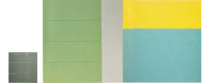
- Azul Olancho 1987 Acrylic, oil on canvas 184cm X 328cm + Four and a Half 1987 acrylic on canvas 87cm X 81cm

-

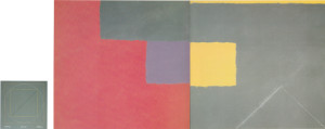
- Una Noche en Masaya 1987 Acrylic, oil on canvas 236cm X 224cm + Sixteen Squares 1987 acrylic on canvas 87cm X 81cm
-
- Chisuma
-
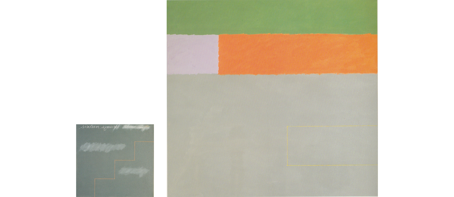
- La Managua Consigna 1987 Acylic, oil on canvas 213cm X 328cm (two panels) One Fourth and One Fourth 1987 Acrylic, oil on canvas 87cm X 81cm

-
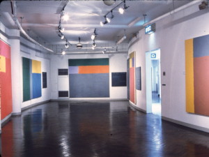
- Gallery space

An Essay for The Exhibition
This exhibition of the art of Hitoshi Nakazato highlights his most recent work, while it contains some paintings, prints, and drawings done over the past twenty-one years. The latest work signals a change in direction in Nakazato’s art, at the same time it makes explicit ideas implicit in his earlier work and suggests intriguing relationships among a variety of contemporary developments, such as color-field painting, systemic art, and conceptualism. The ideas can be best understood by analyzing Nakazato’s recent work in some detail.
One of the most striking aspects of the latest pieces is their arrangement of clusters, in which several canvases, most often three in number are linked either physically or conceptually. Generally two, equally-sized, some-what large canvases abut one another as in a diptych, conjoined to form a single entity with a single title. The “diptych” is accompanied by a smaller canvas, what Nakazato calls the “companion piece” for the larger supports. The “companion” is placed next to the other piece, and is conceptually related though not physically contiguous with it.
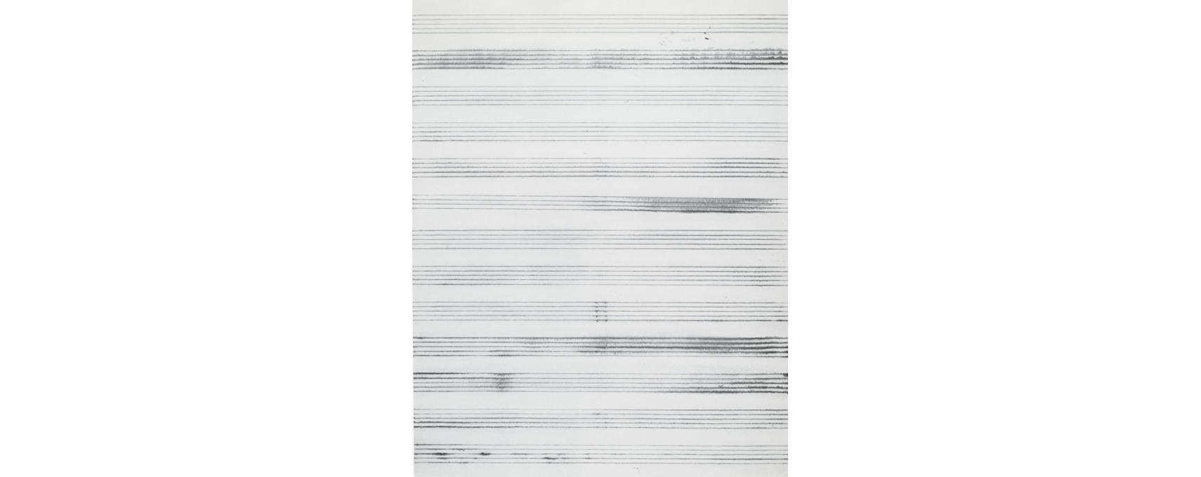
These smaller canvases play a special, polyvalent role. Nearly square in shape, the “companions” frequently have characteristics associated with sketches: small size, reduced number of elements, unmodulated, all-over neutral gray ground, functioning like a blank paper to be marked, or a blackboard to be written or drawn on, writing itself, line defining a geometry related to the writing, and area of erasure and reworking. The major elements of these pieces are the lines forming geometric shapes and the hand-written words. The words, such as “One Fourth and One Fourth,” “Sixteen Squares,” or “A Thing, Refinement or Three Boxes,” which are also the titles of the pieces – suggest instructions the artist may be carrying out in the work. The lines – in the case of One Forth and One Forth (1987), dividing the canvas into four parts, and further slicing some of the internal divisions into fourths – demonstrate the verbal-visual relationships.
The companions – diagrammatic, didactic, punctuated by smudged out and rewritten words and re-drawn lines – wed Abstract Expressionism’s revelation of artistic process in the product with conceptualism’s often blatant explication of the ideas underlying the piece. Moveover, these revalations, ideas, commands appear to carry over to the larger accompanying canvases, helping the viewer to grasp an aspect of the logic of the entire grouping. The larger supports never contain writing, sometimes contain lines that may or may not correspond to the words and markings of the small companions nearby, introduce color with a vengeance, and have some variety in the application of pigment. These characteristics define the larger works both as final paintings rather than as preliminary sketches and as works the rationale of which is not made flagrant by the inclusion of works and lines.
Thus, we look at the larger pieces as pure painting, unobstructed by geometric or verbal guidelines, but we gain greater and deeper access to their workings, because this kind of information is provided by the companions. The larger canvases, however, are never servile or rigid outcomes of ideas spelled out in the companions. They maintain some independence, not only by emphasizing elements associated with painting rather than with drawing or sketch, but also by not consistently obeying the logic of the companions. In addition to asserting the autonomy of the paintings, this defiance of the rules introduces a welcome irrationality into a process that could have become overtly dogmatic and dry.
An examination of some of these individual groupings demonstrates how this procedure operates. For example, the companion piece One Fourth and One Fourth, is relatively explicit in terms of instructions. Obedient to its title, the gray grounded, One Fourth and One Fourth is divided by lines into four quadrants, and several of the compartments are further subdivided into fourths. Like the issuings that often determine the procedures in Sol Le Witt’s art, these commands can be taken to a variety of extremes: subdivision could continue ad infinitum or stop at any point. Thus, the regulations do not allow for arbitrariness. One Fourth and One Fourth also has its title and this verbal determination inscribed onto the piece, strategically located in the one quadrant where no further sectionalizing occurs, as if to indicate an equivalence between language and vision.
The two supports accompanying One Fourth and One Fourth are meant to function as a single work, arranged together as a diptych, bearing a single title, different from that of its companion. Some of the properties in the diptych seem to be determined by the strictures of the companion piece, and some seem to violate or ignore them. As well, the larger supports have vibrant color and noticeable brushstrokes, elements absent or minimal in the companion.
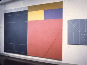
Entitled La Managua Consigna, the significance of which I shall address shortly, the larger work consists of two substantial canvases placed side-by-side. The left wing is more closely linked visually and conceptually to the companion One Fourth and One Fourth. This half maintains, for the most part, the dull gray ground of the companion, has areas of smearing suggestive of erasures and has as one of its properties, an instantly recognizable geometry of four rectangles associated with the dictate “One Fourth and One Fourth.” But these rectangles, superficially attached through the number four to prescriptions of the companion, are less clear as “fourths” of anything, except of themselves.
The left portion of the work appears torn between following the logic of the companion, thus functioning as an oversized sketch, and asserting its own independence as the physical half of a monumental, full-size painting. Confounding the logic of the “One Fourth and One Fourth” command is not the only means by which autonomy is achieved. Several elements in the left panel announce that other matters are important here, matters of color, brushstokes, flatness, and edges of both the canvas and where the zones of color meet. For instance, paint application, though relatively tight, is expressive, color creeps in, noticeable in the yellow delineations of the rectangles, the thin strip of red at the left edge, and the completely different band of color at the top. Nakazato carefully works these areas where colors bound, so as to deny any sense of figure-ground relations and to prevent any color from reading as on the top of another. Consequently, the entire surface seems interwoven and pulled taut, appearing as a flat support comprised of flat fields of hue.
All these elements, introducing subtly, or perhaps even timidity into the left wing, become major players in the right half. This point is made up of four zones of beguiling hue, a concession to the “one fourth” idea, although the rectangles of form are not produced through line, but through color. Once more, Nakazato brushes the boundaries of color areas so that they appear snugly interlocked, guaranteeing a reading of surface as flat.
The colors of the right side also related to those introduced on the left: the yellow of the outlines of rectangles becomes a rectangular patch of hue itself, as if the edges had bled to fill themselves in. The slender strip of red at the far left assumes center stage as the largest field of hue on the right, as if this color, somehow incarcerated within the gray geometric logic of the left panel, has become free and celebrates its liberation as a dominant ravishing force on the right. If this color feels reminiscent of that of Henri Matisse’s The Red Studio, it is because Nakazato’s hues not only is close in tone to value of Matisse’s, but also partakes of the hedonistic, emancipatory, and baccanalian associations of Matisse’s red.
In addition, Nakazato conducts a variation on typical Matissean ploy of placing related visual elements (in Matisse, most often complimentaries) at the borders of the works so that their dialogue across the support activates the entire piece. Nakazato’s approach, exemplified in La Managua Consigna, is to force seemingly slight elements at the extremities to communicate with major elements that may start at the opposite edge but stretch to occupy a substantial territory within the work. For instance, the red silver at the left edge pairs with the red at the top edge, except that the red at the right extends to define a major chunk of the entire panel and abruptly stops where it meets the left panel. Provocatively, the two reds engage in this vibrant optical dialogue across the expanse of gray that houses drawn rectangles, the zone that appears most conceptual and least visual in the work. In another instance, the linear geometries that dominate the left panel are picked up in the right half by a diagonal line that runs from right edge to bottom edge and slices the large right field.
Intriguingly, because this diagonal appears fragmentary and appears to travel to and from the mid-points of the right and bottom sides of the right wing, it reconnects conceptually with the companion piece, seeming to be one fourth for four potential diagonals that would demarcate both the foursided lozenge in the center and quartet of identical triangles at the corners. As well, the triangles, if rearranged and put together, would be identical in shape and area to the lozenge. Thus La Managua Consigna, the left half of which at first seems visually and conceptually closer to it’s the physically discrete companion piece than to its own right half, now reveals that the right half is also firmly tied to the separate companion. As a whole, the three canvases or two entities, carry on a constant communication, like the polyphony of fugue (and interestingly a fugue is often regarded as more a “procedure” than a “form,” and thus relates to Nakazato’s approach); themes or expositions are introduced, but are then repeated, modified, sometimes intersecting, sometimes pursuing independent tangents or episodes.
Of course, a crucial distinction between the companions and the larger paintings is their titles. The names of the companion feel conceptual and prescriptive; those for the larger supports feel exotic, poetic, evocative. But Nakazato, faithful to his roots as an abstract color-field painter, believes that titles should avoid explicit non-pictorial allusions, but should be selected at random, as if picked out of a hat. For Nakazato, the title derive from “what’s in the air,” was the Iran –Contra Scandal hearing. Thus the title are inspired by Nicaraguan subjects. However, just as Nakazato bends rules he sets up in the companions, he assigns titles that might tease the viewer into imagining associations beyond the exclusively formal. For instance, the expanse of turquoise blue occupying the bottom three-quarters of the right-hand support in Azul Olancho [Blue Olancho] (1987) may evoke the sea, or the linear arcs lyrically peppering La Onde de Amapala [The Wave of Amapala] (1987) may suggest waves.
It is more difficult, if not impossible, however, to detect political ideology in these works, despite their reference to sensitive, volatile, political issues. Nevertheless, Nakazato, though most interested in the formal and now the conceptual possibilities of art, is not an apolitical artist. Especially during the activist 1960’s, he produced subtle, spare works, in which unusual application of media – for example, stretching string dipped in ink across raw canvas – owe a dept to modernist idiosyncratic procedures from Dada through Abstract Expressionism. More importantly, the process and look, defying rules and prevailing practices are meant to function, in part, as esthetically analogous to political protest.
Just as the title of the larger, color-field pieces may elicit poetic or even representational associations, the formulaic, often mathematical titles of the companions can derive from the produce a range of sensations beyond the conceptual and diagrammatic. One, Two, Three (1987), referring both to the three basic geometric shapes – square, circle, triangle – and to pure systemic enumeration, also visually alludes to Leonardo’s famous drawing Human Figure in a Circle, Illustrating Proportion. Four and A Half (1987), despite its arid-sounding module (encouraging asymmetry, however) which determines rules followed and altered in both itself and the accompanying Azul Olaancho diptych, also connotes something meditative in its derivation from the prescribed placement of Tatami mats for the Japanese tea ceremony.
Built into its title, A Thing, Refinement, or Three Boxes (1987), is a sense of mystery and possibility. Relating to multiple meanings in Chinese characters, the title and characteristics of the work – a near square, light gray canvas, inscribed with the title and with three yellow-outlined squares- instantly spark a myriad of associations. The three boxes (diagrammatically represented in the paintings as three squares) could refer to the three physical elements of this particular cluster: the companion piece, and its accompanying two joined canvases entitled El Fondo de Barra (1987). Furthermore, in the context of this exhibition, the work itself, placed in a room, and the room situated within a museum suggests three nested boxes. Thingness, an appropriate tag for signifiers such as verbal-visual characters, also fits Nakazato’s art well, since his work frequently stress their “objectness.” As well, refinement aptly defines both the nature of Chinese characters and the nature of Nakazato’s art, the latter being meticulous, subtle, and often, stunning in its arrangement of color and form, a special blend of carefully-weighted, contrasting blocks of color-fields, masterfully-worked areas where colors bound, and delicate, deft geometric delineations.
The question arises as to why an artist like Nakazato, so savvy a color-field painter, became attracted to conceptualism. On the surface, the emphasis of optical qualities and the eschewal of the extra-visual in color-field art seem world apart from conceptualism’s reduced concern with a traditional visual-object as its medium and its concentration on non-visual ideas, especially on language. But, it should be recalled that color-field art received its critical justification precisely because of its adherence to a prescribed pictorial rigor, demanding among other things, that piece of flat, optical, non-relational, non-autographic, and pre-conceived. An art that stresses pre-conception, one that is strongly governed by logic, no matter what its source and direction, is not so distant from conceptualism, in which both pre-conception and the logic of the piece stand on their own, no longer requiring a visual intermediary.
It should also be noted that Nakazato is an accomplished printmaker, and the endemic seriality of graphic media informs his paintings, which often occur in series, or in the recent works, as clusters. Obviously, the design on the plate, tone or block is like a module or regulation for the print run. But as in the lithographic series Pantone (1985), on display at this show, Nakazato uses the plate or, in this case, combinations of five plates, to produce 350 printed variations within a system. Even some of the earliest color-field pieces, such as the Penn Series (1966) influenced by Piero Dorazio’s art, demonstrate a penchant for selecting modules, the multiple arrangements of which create surprising variety.
Nakazato’s background as a color-field painter, his experience as a printmaker, even a past job as a translator for an industrial company making him aware of the power and beauty of logic and organization come together in his most recent art. Without sacrificing esthetics, Nakazato introduces less visual, more conceptual impulses into his work. Recognizing, however, that too great a dependence on the conceptual could produce sterility, he allows irrationality, chance, illogic, and defiance to surface where they may. The resulting mix is both heady and seductive.
Gerald Silk, Art Critic
Color Field as Incarnation
To my knowledge, the significance of color field painting has been discussed so far only in a formalistic context. It was none other than Clement Greenburg who stated that the giant painted surface of “Zip” by Barnett Newman should rightly be called a “field” rather than an easel painting. This is indeed true, if one wishes to distinguish a space where color exits by itself from so-called geometric abstraction. If this is taken literally, however, all issues related to painting would be attributed only to formal conditions. For example, post-war painting can also be attributed to formal conditions of the time. Post-war formalism in America is an ideology which emerges under a specific strain (amidst a conflict between gesture painting, under abstract expressionism of the 1950’s and color field painting). I feel that unless there exists a situation in which it is inevitable that an opportunity arise, there is a danger that painting without content emerge.
Hitoshi Nakazato, who went to the United States in the early 1960’s was met by color field painting in its bloom and a strong current towards systematic painting. A self-sustaining, huge color field and production based on an autonomous system – these two philosophies had a decisive impart on his later works. In a sense, we can perhaps say that the direction of his production was aimed at embodying the color field and the system within his own nature. How can the rich potentials of color field pass beyond formalism?
One thing that is consistent in Nakazato is a sort of a grid system of dividing the color field. However, it is the artist’s unyielding stance in maintaining color itself as the main theme which draws a sharp line between simple abstract composition and mere variations in patterns. Of course, we cannot consider Nakazato a so-called colorist. Rather, he intends voluntarily to “incarnate” the color as a concept, instead of creating a gratuitous festival of colors. The size of the color field and relations between different colors are controlled by an underlying grid, rather than by the harmony on the painting surface, in constant tension. The vertical, horizontal and diagonal lines, as well as the circular arc that we often find in his painting are not for the sake of compositional balance. They are supplementary lines intended to grasp the color field, or drawn to “define the flat surface” in his own works. The color fields are painted uniformly and literally flat using a roller, but little irregularities remain along the edges. The slight motion also helps to bring tension to the static flat surface.
Certainly, he does not regard production as a systematic “management” of approaches. The grid is not developed as an independent pattern, as it is dominant. Rather, in his recent works he dismantles the grid consciousness from the starting point, obliterating it progressively as he works, aggressively experimenting with painting one layer over another to “react to what is happening on the painting surface.” As shown in his statement to this exhibition, he “expected and sought unexpected factors on the canvas, and tried hard to make many things happen.” Such a position further reinforced in his latest work. As regarding the richness of the image, he seems to be heading in a more self-conscious direction. However, his original point of incarnating conceptual elements with certainly be sustained firmly in this unseen series. Further, we can anticipate a new approach in his “Companion Piece.”
Let me put it this way, living under a situation different from that in the 1950’s, he assumed the unending conflict of form and content to active his own picture. The conflict certainly of many layers and is included, as Edward Fry says, the conflict between Japanese traditional form and modernism. We cannot overlook the fact that he was a Japanese living in a special environment called New York. In any event, his attitude was certainly a sincere one, totally justified by the fact that he is an artist who strictly “adheres to image making.”
Akira Tatehata, Art Critic